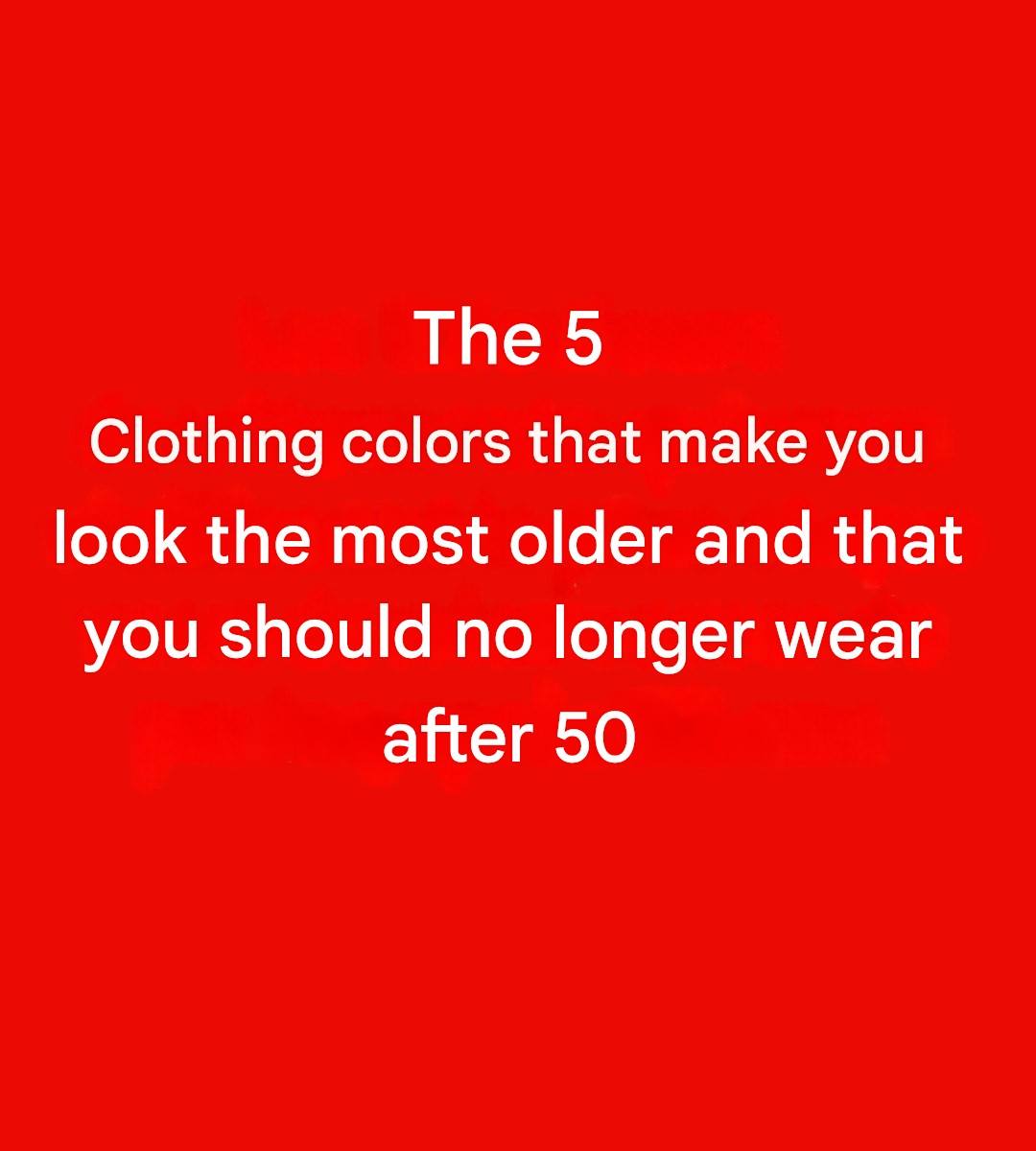
We love black: it makes the figure look slimmer, elevates any outfit, and makes our hectic mornings a little easier. However, when worn on the face, black can accentuate natural shadows and make features appear harsher. If you truly love this color—and we understand!—it’s best to choose it for the lower half of your face or soften its intensity with a colorful scarf, light-colored jewelry, or subtle makeup.
A navy blue that’s too dark: When elegance lacks brilliance.
Dark blue is often considered a safe alternative to black… but at high saturation, it can produce a similar effect. The result: The complexion appears less even, less radiant, as if the light is no longer being reflected optimally. To maintain elegance and luminosity, opt for lighter shades of blue: royal blue, indigo, peacock blue… true allies for a healthy complexion.
Pastel colors: They appear soft on paper, but less flattering on skin.
They evoke images of summer ice cream, light sweaters, and the return of warmer days. Sometimes, however, pastel shades offer too little contrast with the skin and can make the complexion look somewhat tired. But you don’t have to banish them altogether: They can be used subtly in accessories, or you can choose slightly bolder versions like a light raspberry pink or a vibrant sky blue.
Khaki green: trendy, yes… flattering, not always
See more on the next page
Advertisement
